College students are constantly suffering from a limited budget. I found that my peers did not widely use budget apps and I heard them talking about how discounts apps that were supposed to help them save money instead make them spend money on more unnecessary things.
So I ask the question: How can we design an app that can help college students save money?
MY GOAL
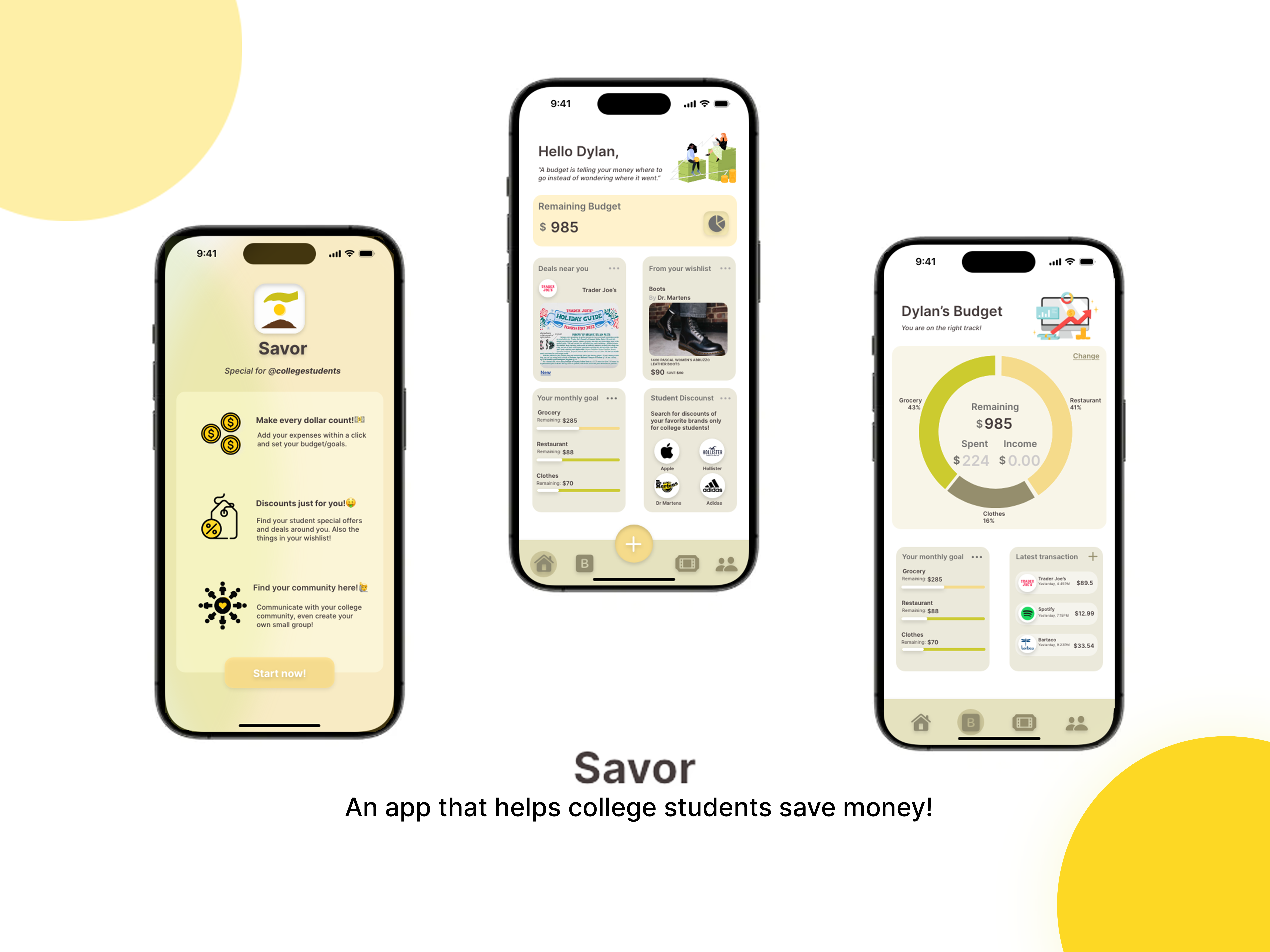
My goal is to design an app that is accommodated and special for college students that can help them save money in different aspects of their life. I want to incorporate convenient budgeting,customized discounts, and warm community into my app.
UNDERSTANDING MY USERS
The first thing I did was secondary research – to have a general understanding of my audience as well as some relevant apps.
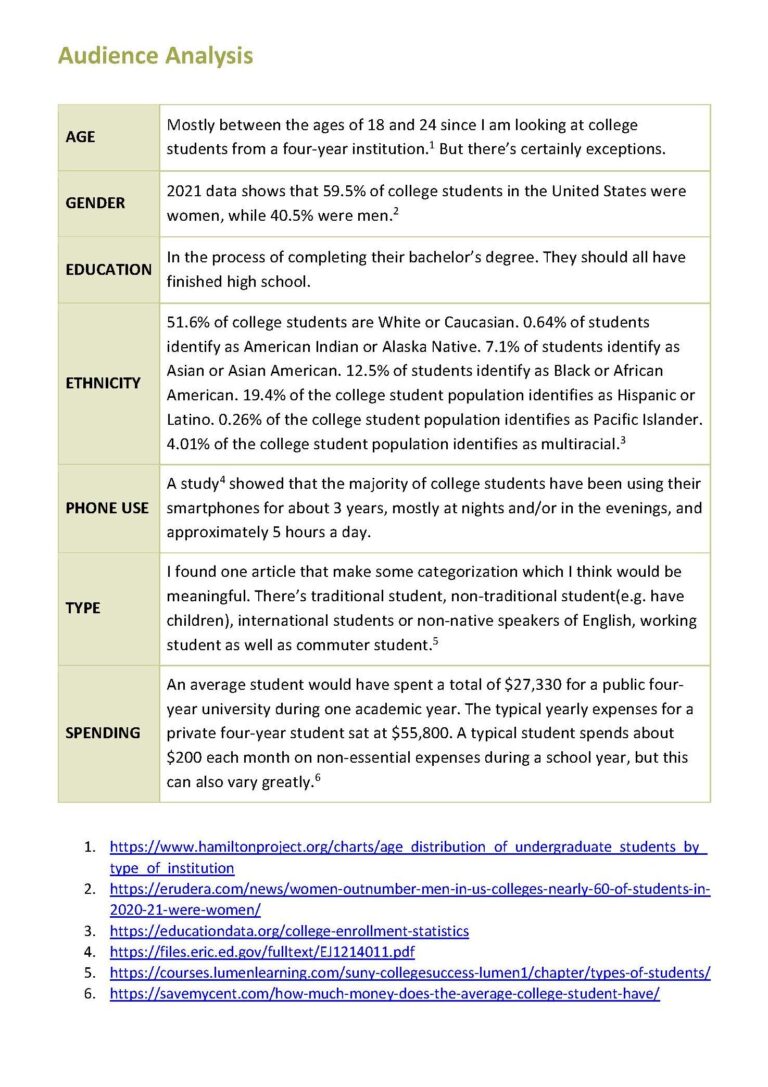
Screenshots of my research notes & Audience Analysis
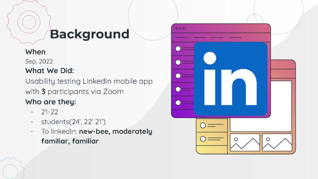
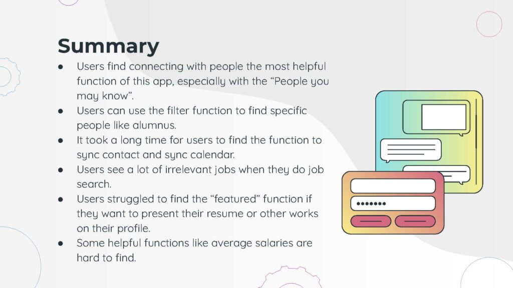
The next thing I did was usability testing with the LinkedIn Mobile app with 3 users with different levels of familiarity with the LinkedIn mobile app. The functions of my app are quite different from LinkedIn but one important insight I can gain from it would be how to appropriately incorporate a lot of different functions in an app. I paid special attention to smooth navigation from page to page when I was designing my app.
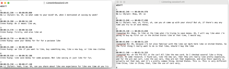
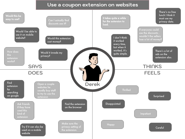
As a college student myself, I am afraid that I would be biased by this fact by paying attention to only my personal needs instead of truly putting myself into others’ shoes. That’s why I carried out 2 listening sessions to understand how other college students interact with money and their experiences saving money.
Screenshot of listening sessions transcript
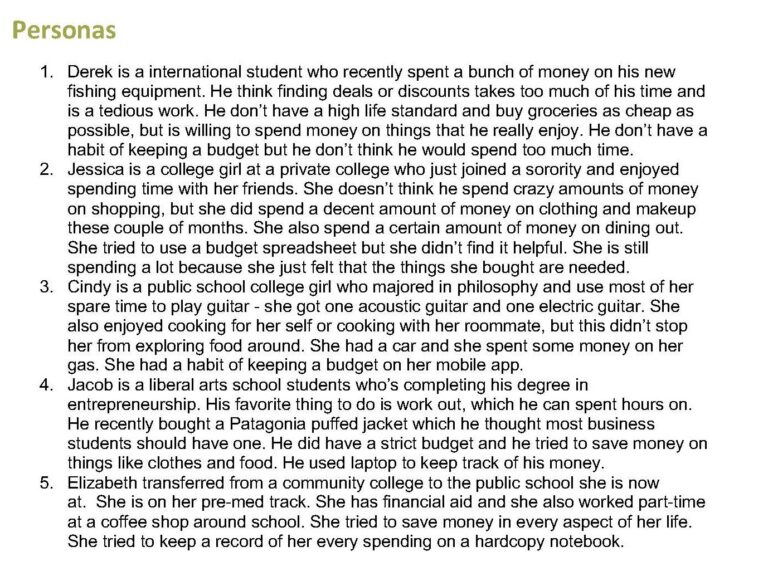
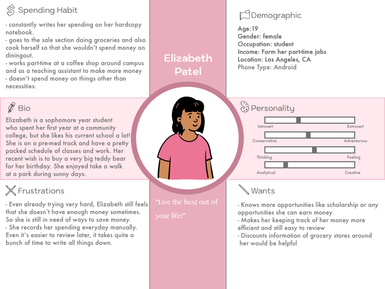
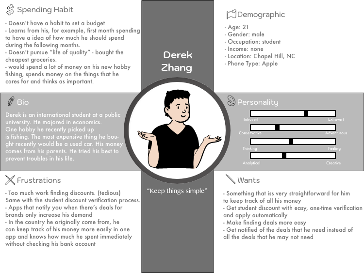
Then I created 5 different personas that are completely different from each other to understand different users and their needs in terms of saving money.
My 5 different personas
Posters of my 2 personas and their empathy maps
DESIGNING
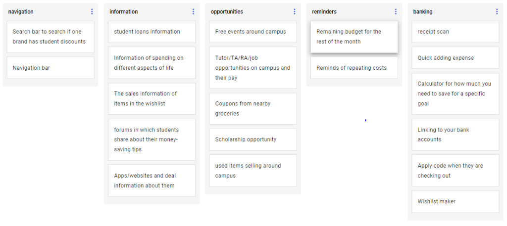
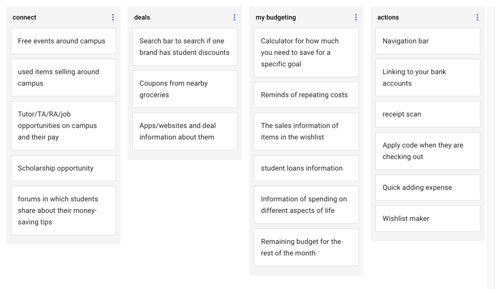
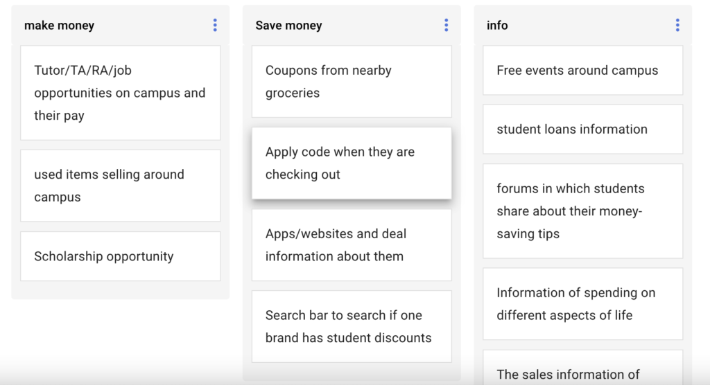
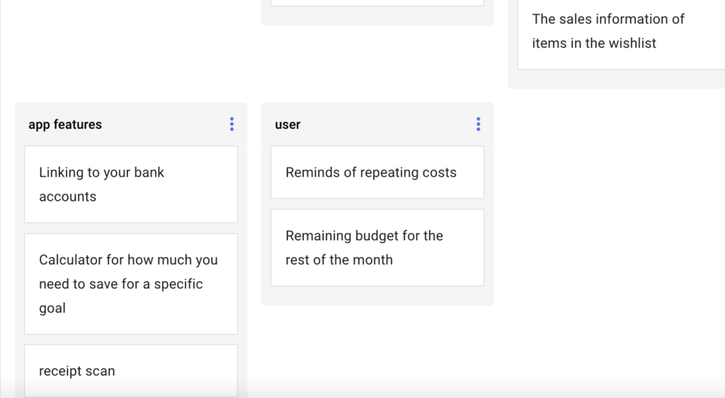
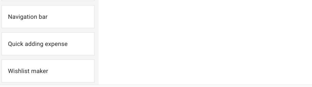
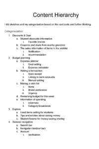
The first step of starting the design is to know the basic functions and content hierarchy of my app. I listed assets I wanted to include in my app and asked my peers to do card sorting for me. This helped me understand what’s the most intuitive way for my users to find the functions under categories. And based on the feedback I have my initial hierarchy.
The card sorts by my peers
Thinking process of content hierarchy
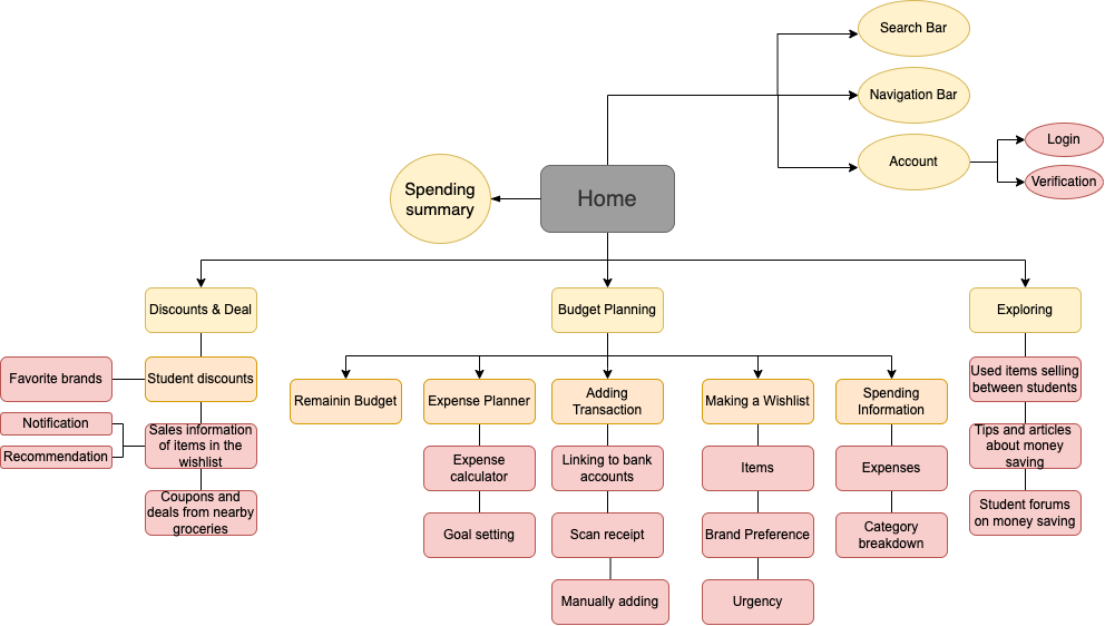
My initial hierarchy after incorporating ideas from the card sorts
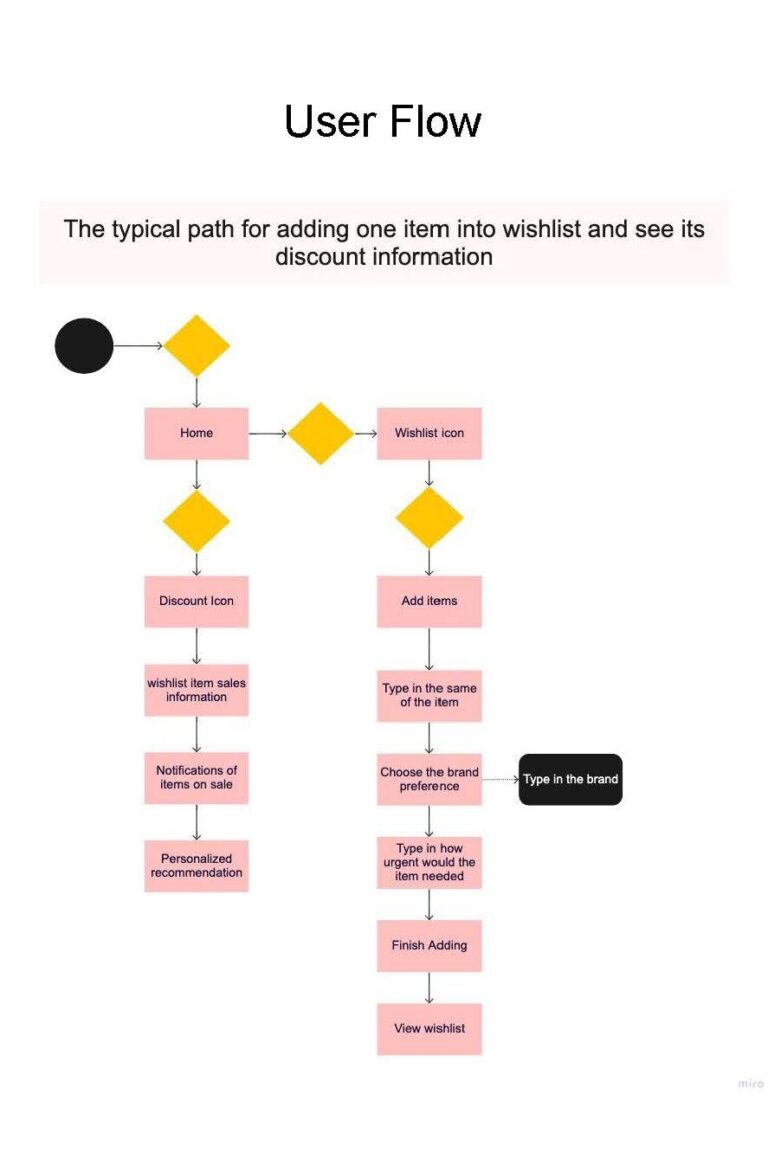
Then I created user flows to visualize how users would navigate through the pages within the app and this further inspired some further modifications to my original hierarchy when designing the app.
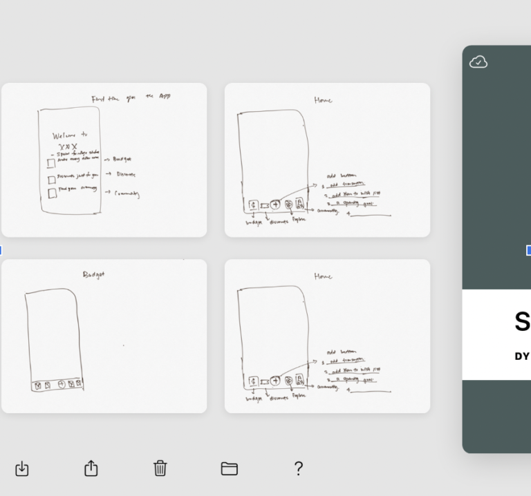
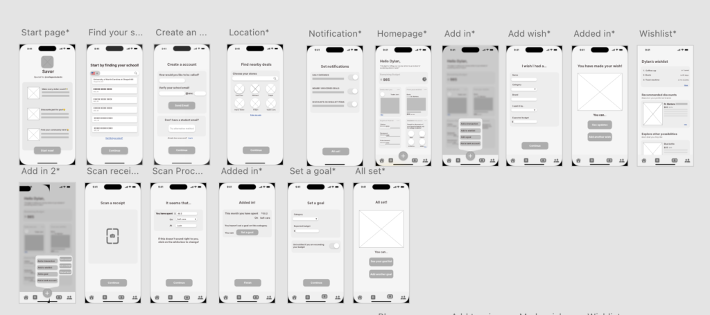
The next step was to visualize the app by designing some wireframes of the app.
Sketches of wireframes
Two user flows wireframes
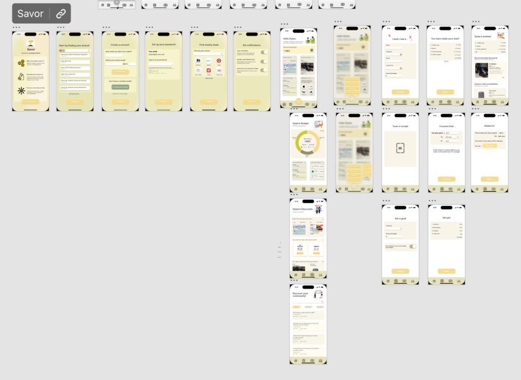
After the drafting out the wireframes, I created a style guide along with my mockups.